Creating a Clean and Clear Experience for Gym Member Management
Research, Information Architecture, High-Fidelity Mockup
Freelance Work
UI/UX Designer

OnlyGym is a Software as a Service (SaaS) website that provides gym necessities and member data management for gym owners. One of the features of OnlyGym is the ability to manage memberships and monitor the progress of each member and trainer.
OnlyGym is a Software as a Service (SaaS) website that provides gym necessities and member data management for gym owners. One of the features of OnlyGym is the ability to manage memberships and monitor the progress of each member and trainer. This feature represents one of OnlyGym's business models and is offered through a subscription-based service for gym owners seeking to manage their gym members and trainers more effectively. Gym owners who purchase or subscribe to OnlyGym's services will benefit from enhanced ease and efficiency in managing memberships, members, and trainers. This is the value proposition that OnlyGym offers to gym owners.
Problems
Challenges faced by OnlyGym as a gym service provider:
Poor Interface Design and User Experience: The current interface design and user experience are subpar, impacting the efficiency of gym management, particularly in handling member data.
Inefficiency in Gym Management: The suboptimal UI and UX contribute to the gyms managed through OnlyGym becoming less efficient. This inefficiency is evident in the increased time required to input data, affecting overall operational productivity.
Decline in Revenue: The combination of poor interface design and user experience has resulted in a decline in revenue for OnlyGym, as the gyms under its management face challenges in maintaining operational effectiveness.
Goals
I defined some goals to align with the vision and business goals, here's the result:
How might we create an attractive interface layout?
How might we restructure information for ease of use and comprehension?
How might we establish a simple workflow to facilitate efficient member management?
Our goals are clear, now it's our chance to show the progress and results of how we tackle the problems and goals.
Who are the users?
You might think that the target users of the OnlyGym dashboard are gym enthusiasts, but that's not the case. Let me explain the details.
Based on discussions with stakeholders, here are the details of our target users:
Gym owners with a member and membership system
Employ trainers to assist gym users
Have active members who frequently hire trainers
And the needs are:
Ease in managing member and membership systems
Connecting trainers and members for class and gym schedules
Automatically updating status if a user's membership expires
Adding new memberships
Adding or removing gym members
Assess the Information Problem
Evaluating the information present in the existing design and analyzing how to make it simpler and straight to the point. I found that the information that should be displayed can be simplified and adjusted to the business flow of OnlyGym.

What's the point:
The information is overcrowded, leading to confusion regarding the goals of the flow. This overcrowding causes the UI and UX to become messy and lack proper structure.
The flow is cluttered, requiring specific actions to navigate to other pages to access desired information.
And what's the solution:
After initiating brainstorming sessions with fellow researchers and stakeholders, there will be changes to the arrangement of information and flow to ensure that gym users or owners can easily access member and membership details. Naturally, these flow changes will be aligned with OnlyGym's business goals.
The points:
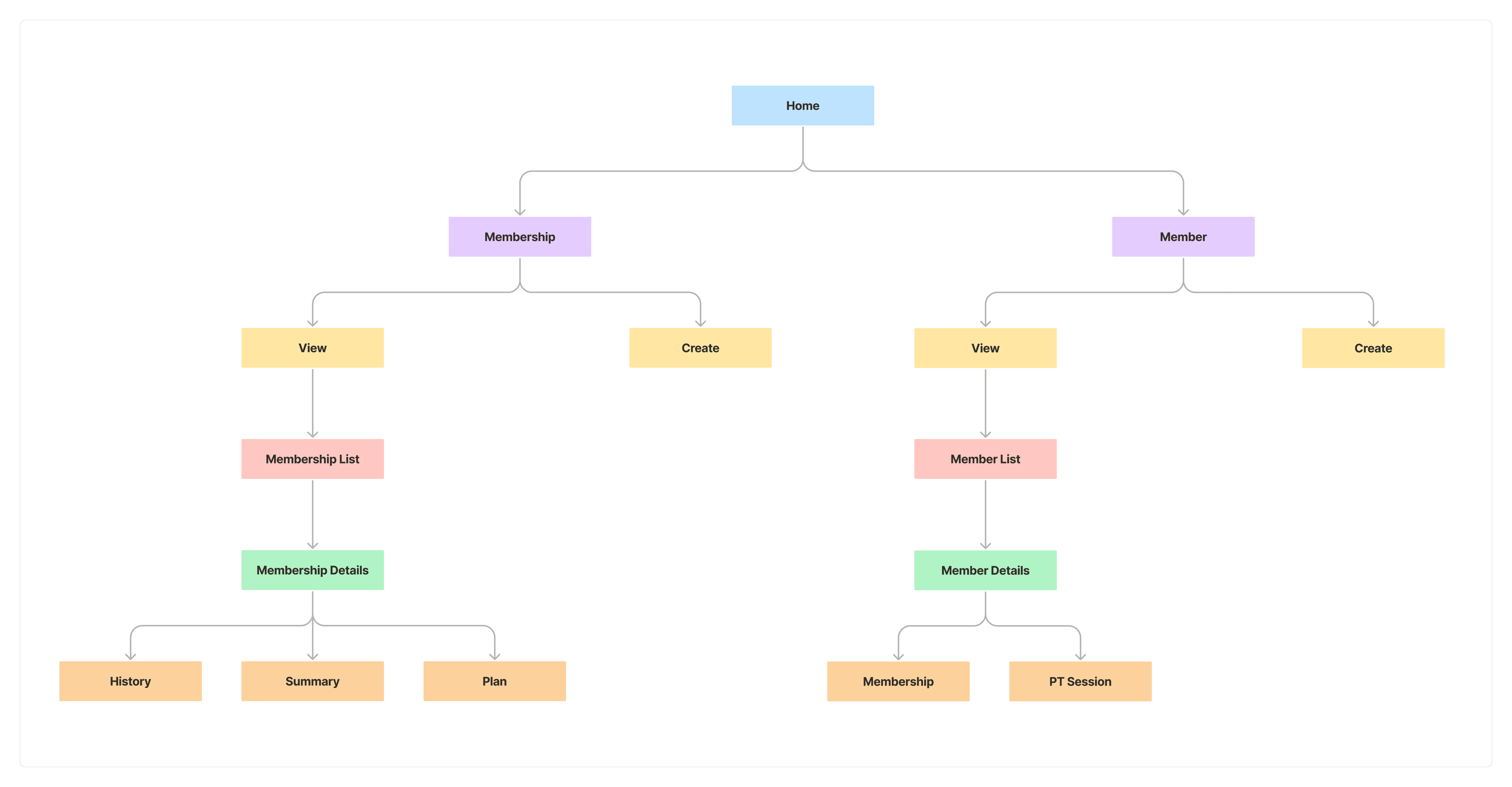
Initially, the information was overcrowded, so I restructured it considering a simpler flow that aligns with business goals.
I simplified the process for users to achieve their goals by presenting the necessary information. This was done by dividing it into two sections based on parent member and membership.
How do we solve the problems
Personalisation Membership Features
To facilitate owners in managing the gym membership list, I personalized the membership feature by providing the necessary information. This is also tailored to the objective of creating an attractive interface layout and easy-to-read information.

Revamp Member Details
The second step to address the existing issues is to revamp the member detail page. In this revamp, we have the following objectives:
Improve usability to ensure owners can easily achieve their goals.
Display necessary information to prevent owners or admins from confusion.
Facilitate owners or admins in managing gym participants.

Design Validation
In making this project, I needed to check if the design worked by testing it with a few gym owners who are connected with the client. Also, I prepared two scenarios for testing, and the findings will show if the design is successful or not. Here are the scenarios:
Is the shown information good enough? After users try out the membership and member flows, can they understand them easily? This tests how easy it is to use and interact with.
Is it easy to manage gym members on one page? The main goal for gym owners is to manage all members regarding payments, schedules, etc. This test checks if gym owners or admins can achieve their goals easily.
Found "OH" Moment
After conducting validation and testing with several gym owners, I discovered insights to improve the design, making it better aligned with their needs. Here are the points found during testing:
Misinterpretation of Information
When looking at the information on the membership detail page, gym owners assumed that they could click on the schedule for that day. This caused confusion and was perceived as slowing them down because of the very striking color.

How to select more than one?
Some gym owners complained that they couldn't select more than one membership status because the widget used tabs. They felt they needed a status filter that could display more than one, as there might be a need to search for several memberships with different statuses.

Iteration and Fixing the Issues
Change the components
Based on the insights obtained earlier, I changed the widget or tab component to a dropdown filter, allowing gym owners or admins to select more than one status. This also strengthens the usability of the status as a filter.

Adjusted widget
On the membership detail page, I updated the "Plan Schedule" widget to avoid confusion when first visiting the page. Additionally, the goal of adjusting this widget is to ensure that the usability of the provided information can be easily read without ambiguity.

Result
The project's outcome is a redesigned OnlyGym dashboard that effectively meets user needs and provides more informative content compared to the previous design. This transformation is also in line with the feedback received from the gym service provider, OnlyGym. To view the results in action, please visit the live website at https://onlygym.id.
Thanks to the team
I would like to say thanks to my fellow Researcher, Sahrul Laila Safitiri who help to this project through research.